
From strategy to identity, we created a brand for SSC that exudes trust, innovation, and sophistication.
Brand Strategy
Visual Identity
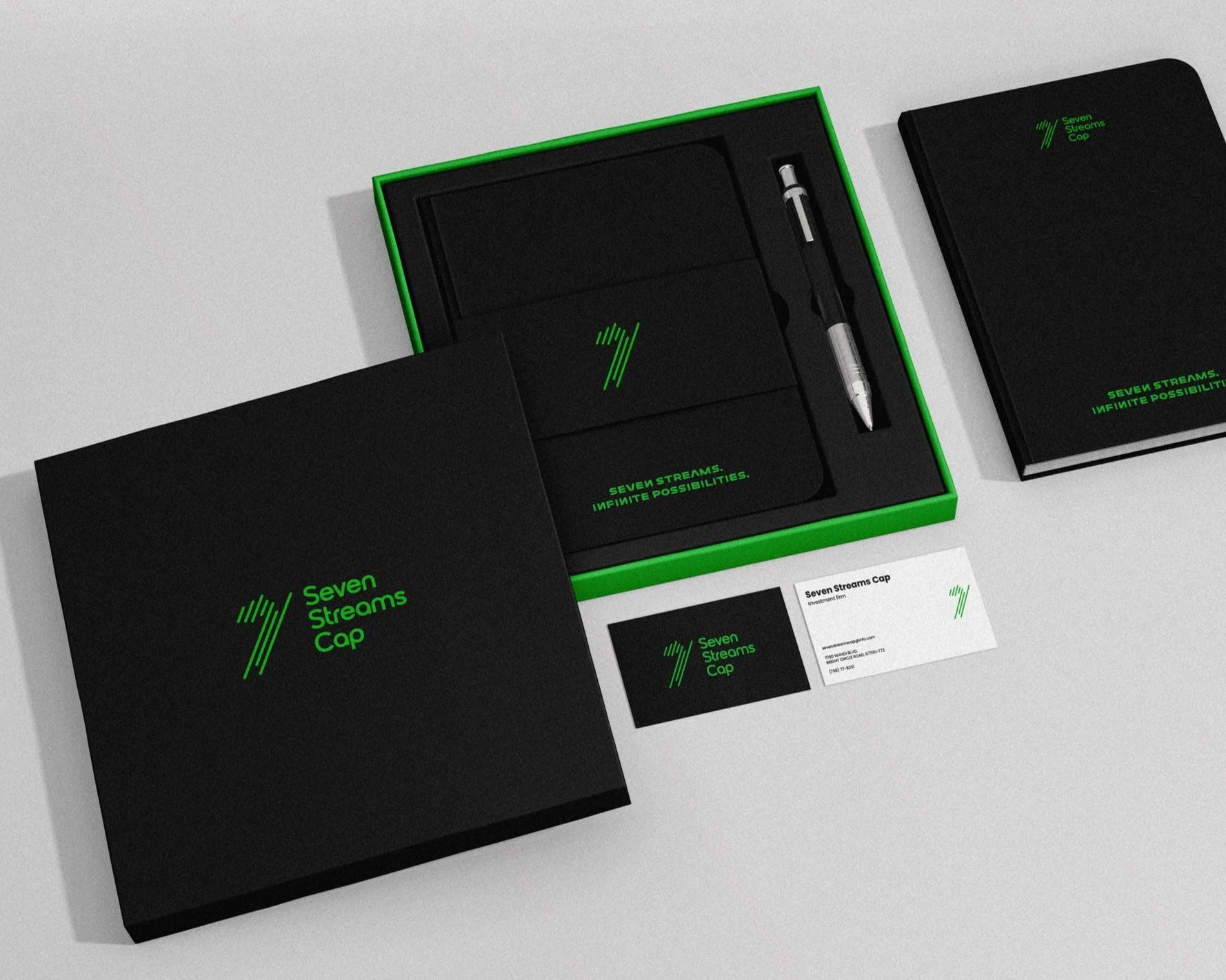
Packaging Design

Industry
Finance & Investment
Location
Global
Background
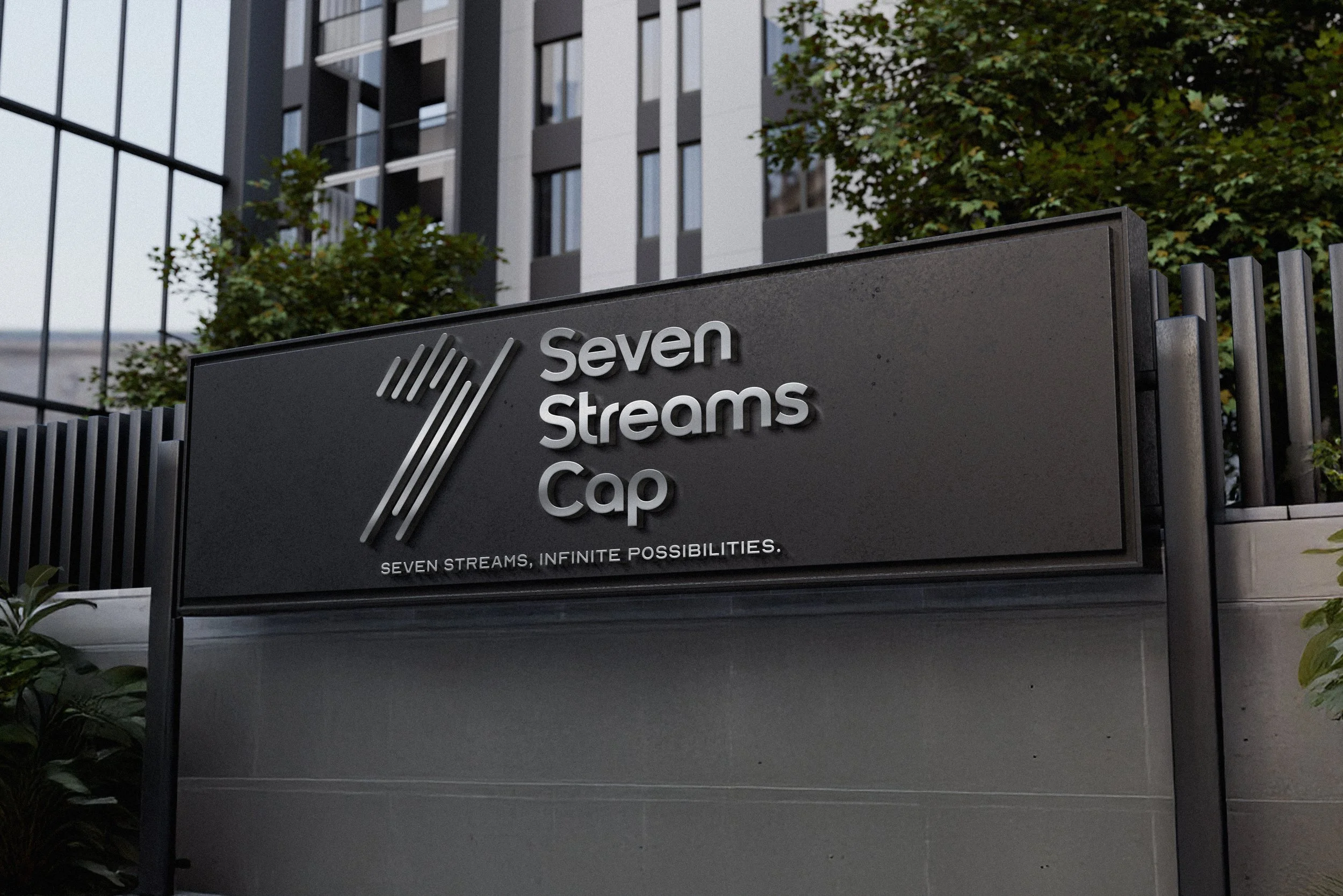
Seven Streams Cap (SSC) is a forward-thinking investment firm named for its dynamic approach and broad scope of activities. The brand’s foundation is the seven parallel lines forming a bold “7” in its logo—a symbol of growth, sustainability, and progress. SSC combines professionalism with modernity, ensuring a balance between authoritative reliability and approachable innovation.
The Challenge
SSC aimed to establish a brand identity that reflects its premium services and innovative approach in a competitive financial industry. The challenge was to deliver a sophisticated, yet versatile design that appeals to a global audience and stands out across various platforms.


The Results
The brand guidelines effectively captured SSC's ethos with a clean and modern aesthetic.
The dynamic logo, typography, and color palette embody professionalism while maintaining visual appeal.
Strategic use of brand patterns reinforces identity and creates a lasting impression across all touchpoints.
The cohesive design ensures SSC’s presence is impactful, whether in print, digital media, or large-scale branding efforts.


Choosing the right marketing partner can be challenging